Designing a clearance queue when nobody could say what clearance was
The product was named after a process. It had a button for the process. Its dashboard reported on the outcome of the process. Nowhere in the codebase or the spec did anything define what the process actually did — so I wrote the rules, and labeled every line I'd made up.
- Complex B2B
- Workflow and queues
- Regulated domain
- Spec writing
- Design systems
- Product
- Internal underwriting platform
- Sector
- Commercial insurance carrier, B2B
- Role
- Product designer, solo
- Timeline
- 6 weeks, 2022
- I owned
- Flow spec, IA, every screen, research plan
- Status
- Specced, handed to engineering
Six minutes if you read the whole thing. If you've got one, read the three decisions below — that's the argument.

- screens designed
13
screens designed
seven of them rebuilt in round two
- stage flow spec
8
stage flow spec
written from scratch, nothing to copy
- states modeled
17
states modeled
with owner and reversibility on each
- trade-offs logged
14
trade-offs logged
four of them pure business policy
Everything after this is detail.
- 01
I wrote the client's business rules, and labeled every line I'd made up
Nobody could tell me what clearance meant and nobody was available to ask. So I wrote all eight checks myself, and put a tag on every rule saying whether it came from the code, from me, or from nowhere yet.
Leave a blank in a spec and everyone walks past it. Write down something wrong and somebody corrects you.
Read the reasoning - 02
Showed all eight checks instead of one verdict
It's more to read right when somebody wants to be done reading. But the screen a compliance examiner asks for and the screen that earns an underwriter's trust are the same screen, and building that twice would have been the real waste.
It moved a confidentiality rule out of a policy doc nobody opens and into the screen itself.
Read the reasoning - 03
Threw out a finished round and rebuilt on shipped patterns
I'd built round one out of what a submissions queue looks like instead of how somebody actually works one. You can't tell those apart from a screenshot. You can tell immediately if you have to use it all day.
I'd designed a queue you'd have to back out of fifty times a shift.
Read the reasoning
Round one looked like a product and worked like a mockup.
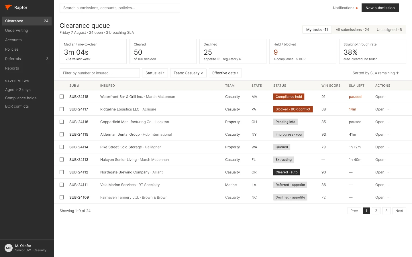
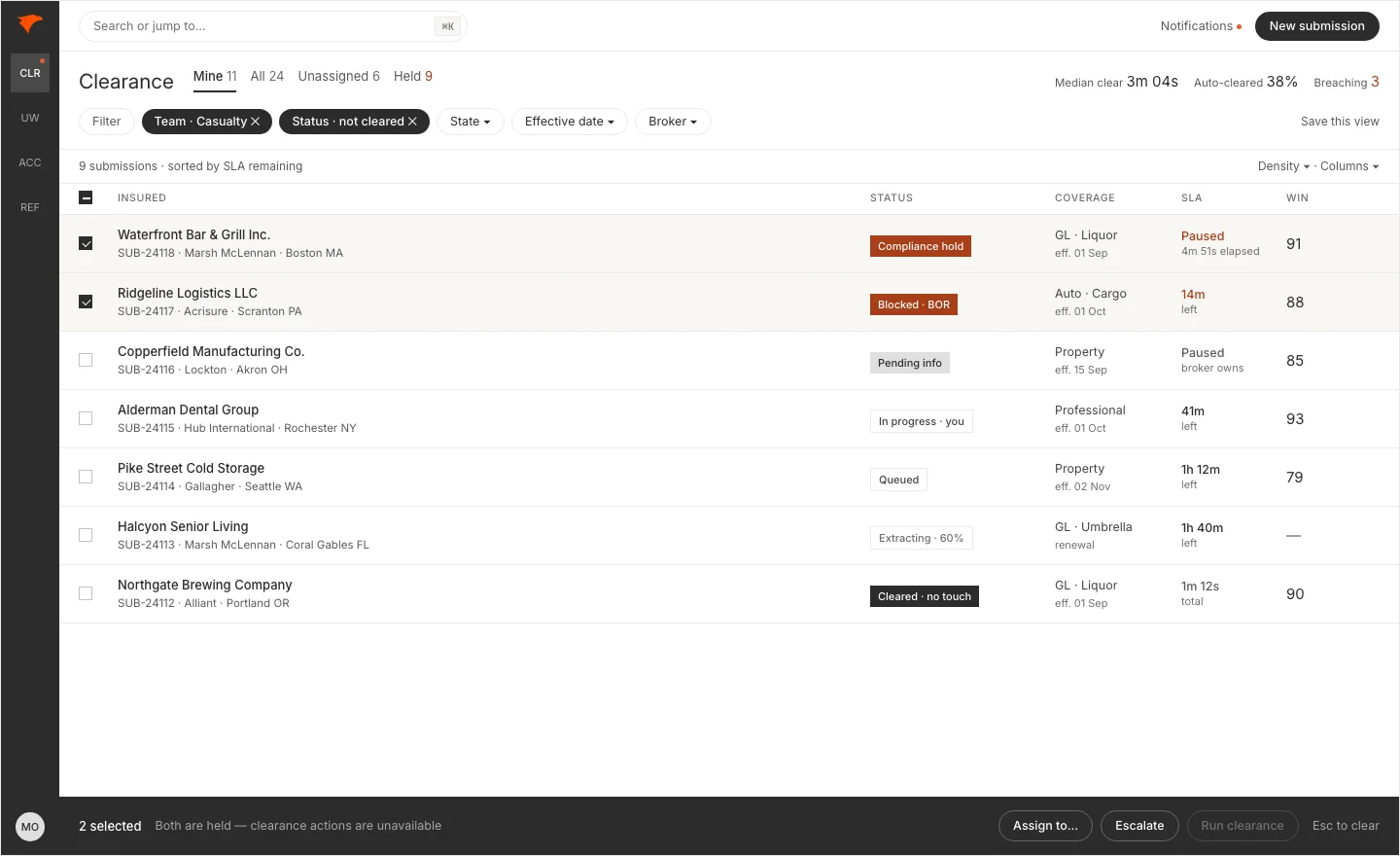
Same data, same palette, four weeks apart. Nothing here is about decoration. It's about whether you can make a decision and get to the next submission without going back to the list first.


The fork
The first round was finished and internally consistent. Nine columns, five metric cards, a modal for the clearance result, an action menu on every row. Ship it, or take it apart.
The tension
Nothing in it was wrong. It was assembled from what a submissions queue looks like rather than from how one is worked. Those two produce similar screenshots and different products.
The call
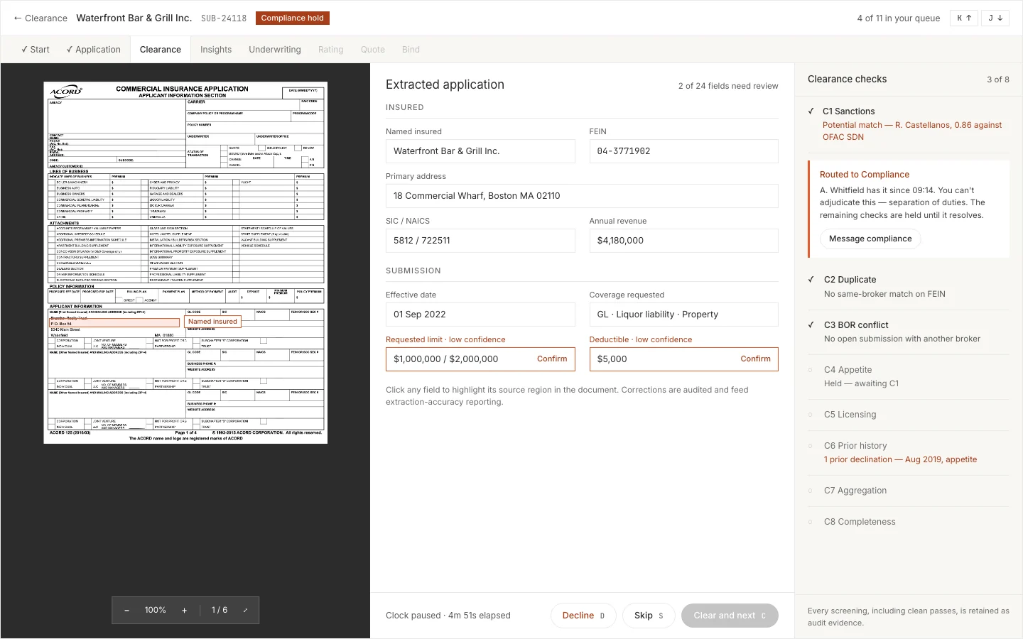
I went back to shipped tools that do the same job — bulk review, document verification — and rebuilt on what they do. Two-line cells instead of nine columns. Selection raising an action bar instead of per-row menus. The check battery as a live rail rather than a modal you dismiss before you can act.
The consequence
Round one had no way to decide a submission and move to the next one without going back to the list. Every queue tool people actually work in all day has that. I had designed a queue you'd have to return to fifty times a day.
I wrote the client's business rules for them, then labeled every line I'd made up.
The fork
Clearance was undefined and the client wasn't available to define it. I could design around the gap — a button, a spinner, a result — and wait. Or I could write the rules myself and hand them back as something to argue with.
The tension
Designing around the gap is the safe move and it gets you nowhere. Writing the rules myself meant a carrier might go build an underwriting control I'd made up out of market practice instead of their own policy. In insurance that's not a UX problem, it's a regulatory one.
The call
I wrote the full battery — eight checks, ordered so the regulatory hard stops run before anything expensive — and tagged every single rule with its provenance. Evidenced in the code. Proposed by me. Or open, meaning no safe default exists and someone has to decide.
The consequence
Fourteen trade-offs fell out of it, ranked by how much of the design falls over if the answer surprises us. Four of them are business policy and no amount of design closes them. Leave a blank in a spec and everyone walks past it — write down something wrong and somebody finally corrects you.
Eight checks. Not one of them written down anywhere in the build.
- Proposed
- 8
- Left open
- 8
Sanctions and watchlist
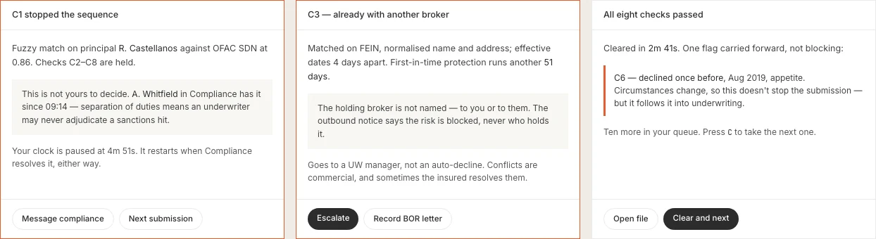
Screens the insured, its DBAs, its principals and the submitting broker against OFAC and denied-party lists. Fuzzy matching, because insurance entity names are noisy. A potential hit routes to Compliance and never to the underwriter — separation of duties.Open — Which list set is in scopeOpen — Whether a sanctions decline may be disclosed to the broker
Duplicate detection
Same risk, same broker — a resend or a resend with corrections. Matches on tax ID first, then normalized name, address and effective-date proximity. Runs at intake, before extraction spends anything.
Broker-of-record conflict
Same risk, different broker. This is what clearance classically means in this market: first in time holds the risk for a protection window, and a later submission is blocked for its duration. Escalates to a manager rather than auto-declining, because conflicts are commercial.Open — How long the protection window runsOpen — Whether a blocked broker may be told who holds the riskOpen — Who releases a block when the window lapses
Sequence aborts above this lineDon't spend an appetite lookup on a sanctioned entity.
Show the remaining five checksHide C4 to C8appetite, licensing, prior history, aggregation, completeness
Appetite and eligibility
Class, state, size band and prohibited-class list against the appetite matrix. Out of appetite declines with the failing dimension recorded; borderline refers to a human. The matrix has to be editable by business users — appetite moves quarterly, and hardcoding it guarantees the tool goes stale.
Licensing and regulatory eligibility
Admitted in the risk state or surplus lines, broker appointed and licensed there, producer agreement in force. A failure here is usually paperwork, not a bad risk — the design has to separate “we can't write this here” from “this broker isn't set up yet.”Open — How far into state-by-state surplus lines rules version one goes
Prior history
Have we declined this risk before, and why. Is there an in-force policy, meaning this is really a renewal misrouted as new business. A prior declination never blocks — circumstances change — but it rides along into underwriting instead of waiting to be looked for.
Aggregation and capacity
Cat accumulation by zone and peril, treaty capacity remaining, single-risk limit, concentration by class. Over the limit refers; it never declines. Capacity is a management decision.Open — Whether version one stubs this and refers manually
Data completeness
Enough to make a decision. Missing required data moves the submission to PENDING_INFO and asks the broker — it is not a decline. The SLA clock pauses there, because otherwise time-to-clear measures broker responsiveness and is useless as an internal metric.Open — The full set of fields that count as required
Every rule in the spec has one of three tags on it. Code means the build already commits to it. Proposed means I'm putting up the industry default, because something to argue with beats an empty cell. Open means there's no safe default and nobody should build it until somebody decides.
The fast version shows one verdict. I shipped the one that shows all eight checks, boring ones included.
The fork
Clearance ends in cleared or not cleared. One line of copy would say it. The alternative was to show the whole battery — every pass, every skip, every reason — which is more to read at the exact moment someone wants to move on.
The tension
Time-to-clear is the product's headline metric, so anything that adds reading time argues against the thing being sold. But the same screen is the evidence an examiner asks for, and it is where an underwriter decides whether the machine is worth trusting.
The call
Show all eight. Put the stop first and let the clean passes collapse underneath it. The screen an examiner asks for and the screen that earns an underwriter's trust are the same screen — building that twice would have been the actual waste.
The consequence
The screen got heavier and every conversation about it got easier. It also dragged a rule out of a policy document nobody opens: when a submission is blocked because another broker already has the risk, you never tell the second broker who. That's a confidentiality obligation, and now the screen handles it instead of somebody having to remember it at 4pm on a Friday.

Every decision bought something and gave something up.
I kept a register of all fourteen, so the client could overrule me on purpose instead of finding out six months later. These five mattered most.
The trade
What I chose
What it costs
- Auto-clear the clean submissions, or make a human touch every one
- What I choseAuto-clear only when every check comes back clean and extraction confidence clears the bar. Configurable, and it ships set tight.
- What it costsStarting tight makes the headline number look worse in year one. But you can always loosen a rule once you have evidence. You can't un-clear a submission that already went out.
- Let underwriters edit the extracted fields, or lock them to the document
- What I choseEditable, with the original always one click away and every edit logged. It's the only way somebody fixes bad extraction without leaving the tool, and the only way anybody ever finds out how accurate extraction actually is.
- What it costsIt makes the audit model harder. Every edit has to be stored as a correction, not a replacement.
- A dense working tool, or the brand's editorial spacing
- What I choseDensity, while keeping the brand's type, color and flat square corners. Somebody working thirty submissions before lunch needs rows, not air.
- What it costsIt looks less like the marketing site than the brand people would like. I'll defend that one all day — throughput is the job.
- Ship without pricing, or hold the launch until the loop closes
- What I choseShip it, and design the seam instead of pretending it isn't there: a thirty-second screen that records what got quoted, where, and when.
- What it costsIt's a chore, and the person doing it gets nothing back for it today. Skip it and you can't calculate hit ratio, which means nobody ever makes the case for phase two.
- Filter in the browser, or on the server
- What I choseServer-side search, filtering and pagination from the first release.
- What it costsMore backend work before anyone sees anything, to solve a problem nobody's hit yet. The volume question that would settle it is still sitting unanswered.
The working documents, if you want to dig.
Closed by default. Everything above is the argument; this is the evidence underneath it, and none of it is worth scrolling past if you have already seen enough.
Structural wireframes — all eight pagesWhere the arrangement got argued, before anything looked finished
Before either round I drew the whole thing with no color and no type hierarchy, so the arrangement could be argued with before anything looked finished. That is also the version I'd show first if I ran this again — the polished round one absorbed a week of review attention that should have gone to structure.

The submission state machineSeventeen states, their owners, and the contradiction it surfaced

Journey map — the underwriting teamEight stages, five roles, and the seven questions that would settle it

One submission, start to finishA restaurant in Boston: held, cleared, referred and bound over six days
Two of those six days belong to the broker and one to Compliance, which is why the product reports elapsed time and net time separately.

09:02
It arrives as an email
Documents are pulled out and a minimum record is captured before extraction runs, so the submission survives if extraction fails. Duplicate detection runs first, before any processing cost is spent.
09:14
A sanctions hit stops it
A fuzzy name match against a sanctions list. It is a false positive, and the underwriter is not allowed to decide that. The screen names who has it, since when, and that their clock is paused — then offers them the next submission.
11:34
Cleared, with something attached
All eight checks pass. One flag rides along: this risk was declined in 2019. It blocks nothing — circumstances change — but it follows the submission into underwriting instead of being something an underwriter has to think to look for.
Day 3
It goes above their authority
Referrals happen constantly, and most systems treat them like an exception — so underwriters learn to route around the whole thing. Here it gets its own queue, its own clock, and a written rationale on both ends.
Day 6
Bind is blocked, and says why
Six preconditions, two outstanding: a subjectivity the broker hasn't returned, and a sanctions screen that is 41 days old. Lists change between quote and bind, so it re-runs. A hard block with a vague reason gets escalated around; this one names what is missing and who owns it.


The round-one set, and what got killedThirteen screens on one vocabulary, seven of them later rebuilt
Round one was finished and internally consistent across the whole product, which is what made it worth arguing with rather than patching. Shown at thumbnail size on purpose — the point is that one vocabulary covered every screen, not what any single one says.

01Sign in 
02Clearance queue 
03Add submission 
04Application detail 
05Underwriting dashboard 
06Referrals 
07Accounts 
08Account detail

Where this work is weakest.
No underwriter was ever in the room. All of this comes off a prototype, a spec, and what I know about how commercial underwriting works. I wrote a discussion guide for two sessions that would have closed six of the open questions, then designed the screens before those sessions happened — because the alternative was designing nothing. Right call given the constraint. Still the weakest thing about this work.
I made round one look finished too early. Show people something polished and they'll give you opinions about the polish. I should have kept the black-and-white version on the table another week and made everyone argue about the structure.
There's a score in the queue I can't explain. Every submission carries a win score. Nobody could tell me how it's calculated, or even whether it means "we'd probably win this" or "this is worth winning" — which are not the same thing. I designed a row-level explanation for it and had to make up what the inputs were. Ship that number without an explanation and the senior underwriters whose time it's supposed to protect will ignore it, which is the one outcome nobody wants.
And there are no outcomes on this page. I specced this and handed it to engineering in 2022. What you've read is the design and the thinking behind it, not what the built product went on to do. I could put a number here, but I never measured one, and inventing it would undo every provenance tag above it. The two I'd want first: median time-to-clear with the pauses taken out, and what share of submissions clear without anyone touching them.
All of this is about screens. Here are the screens.
The prototype this case study was written against, still clickable. Sign-in is a demo — the email is filled in and any password gets you through. The figures inside it are sample data, not measured results; this page still hasn't got any of those.