The One
I had 147 open to-dos, so I built something that shows one
- AI-Assisted Development / Mobile
- Designer & Developer
- Role
- Designer & Developer
- Year
- 2024
- Category
- AI-Assisted Development / Mobile
- Status
- Live
The findings are the argument. Everything below them is evidence.
Designed and built by me in Cursor and Expo, on the App Store in under three weeks, no engineering team and no funding. It exists because of cognitive debt — the weight of every open loop you've collected and never started. Most apps help you store twenty things. None of them help you ignore nineteen.
- daily active, in beta
87%
daily active, in beta
- concept to beta
2-4wks
concept to beta
- TestFlight testers
15
TestFlight testers
I had 147 open to-dos, so I built something that shows one
The use case
Who this is for.
I designed for myself, but three groups emerged in beta: deep-work professionals, essentialists chasing clarity through constraint, and — unexpectedly — the ADHD community, for whom the app works as a cognitive prosthetic. The common thread: people overwhelmed not by a lack of tools, but by too many options.
The design problem
What made it hard.
In UX we talk about cognitive load. This is cognitive debt: the mental weight of every "open loop" we collect but never start. My own to-do list had 147 items — I wasn't managing tasks, I was curating anxiety. Todoist, Things 3 and Linear are very good at organizing, and that is the problem: they're infinite. you can always feel productive by moving a task from "Today" to "Tomorrow." The job to be done wasn't "help me remember." It was "help me commit." > When my list is too long and my focus is thin, help me commit to one thing so I can clear my cognitive debt and feel a sense of progress.
The approach
What I did about it.
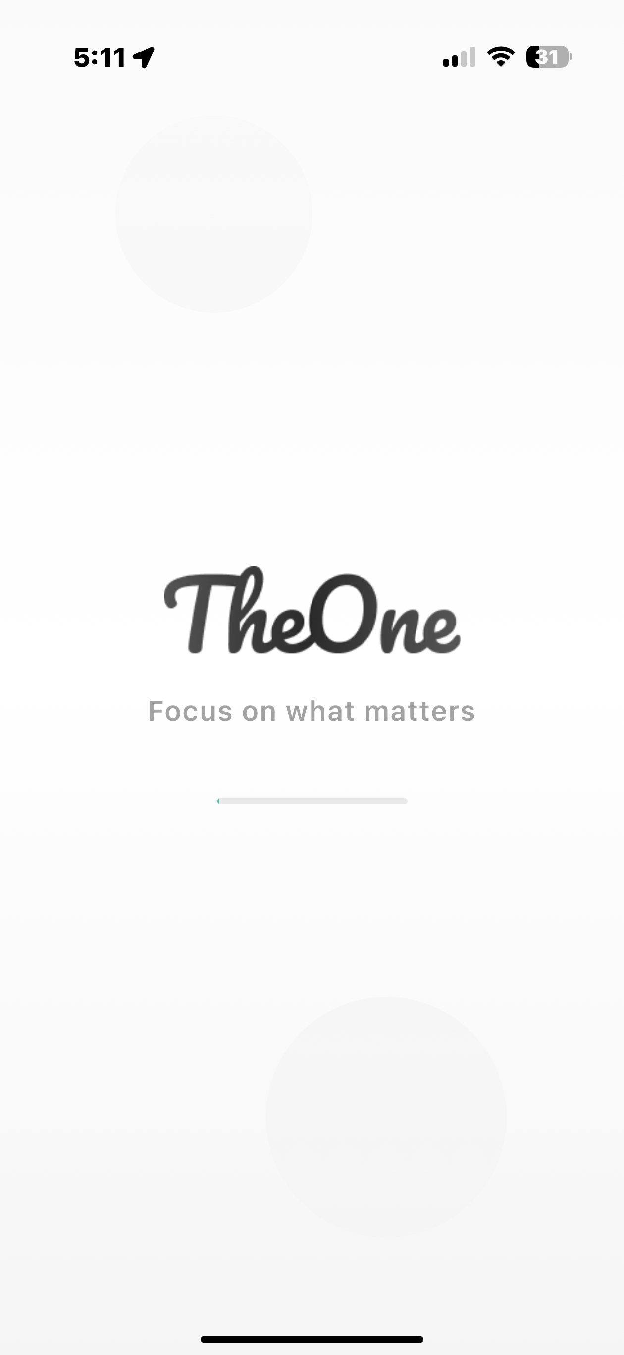
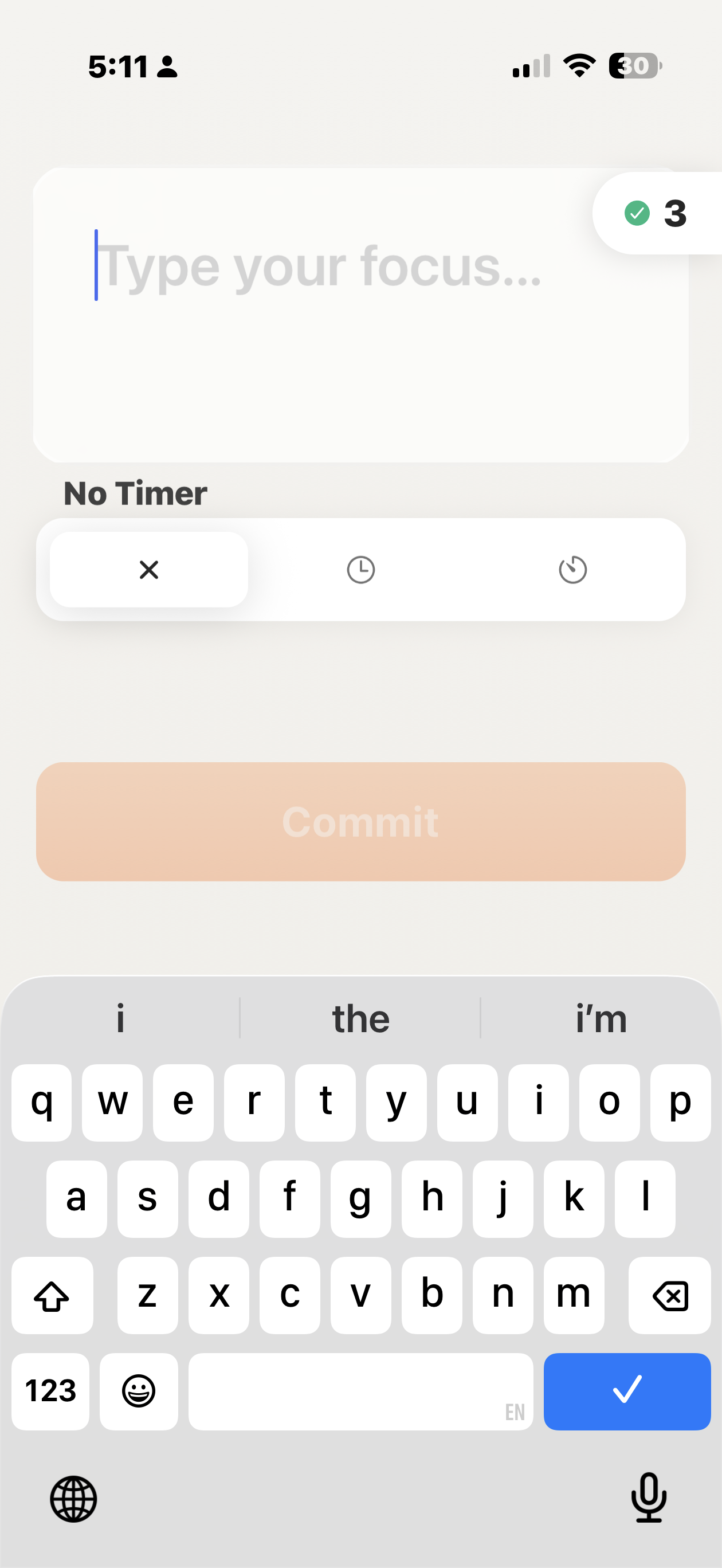
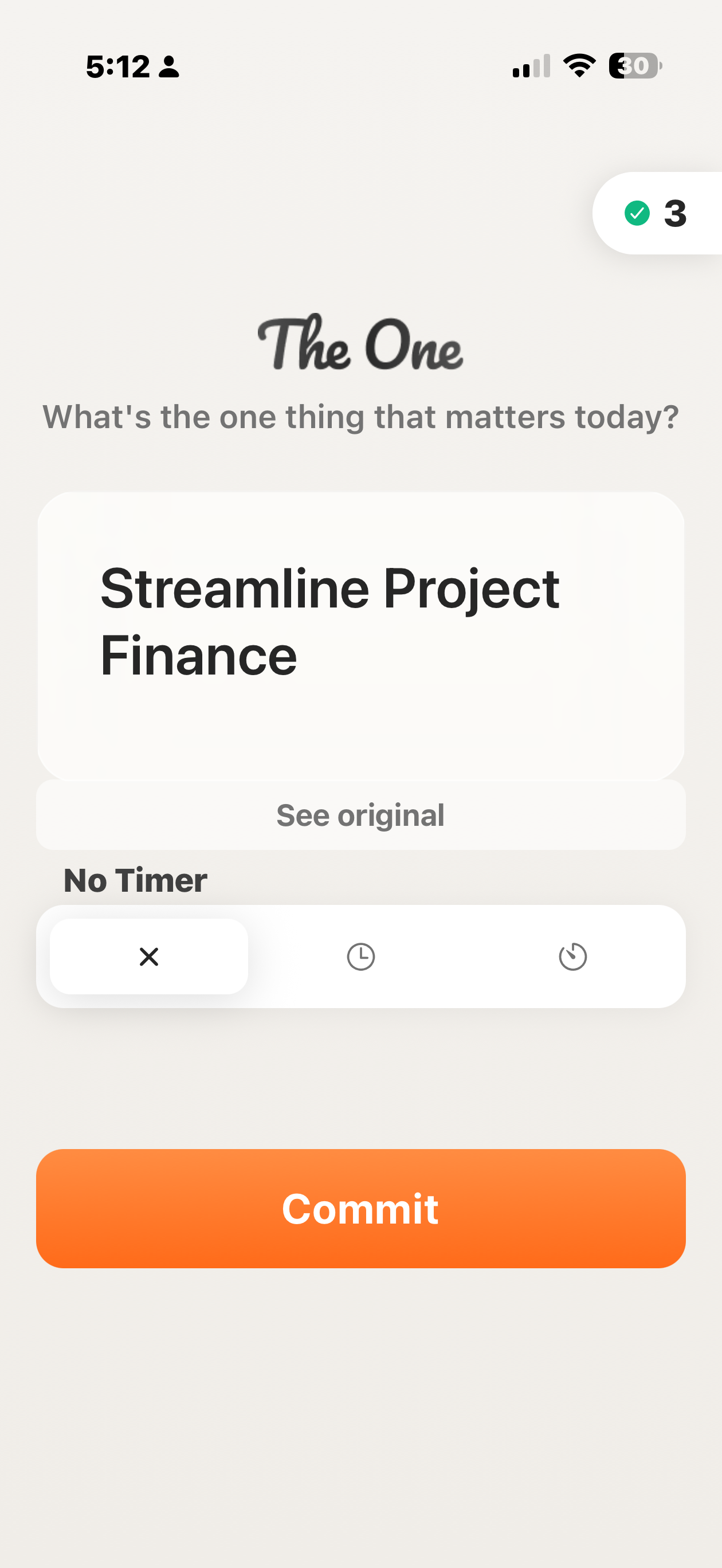
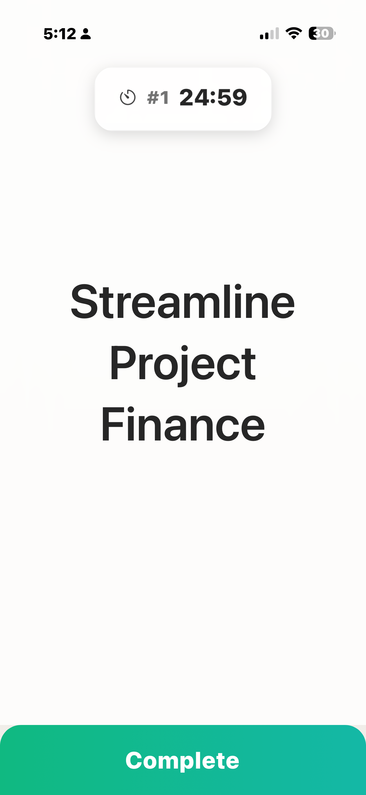
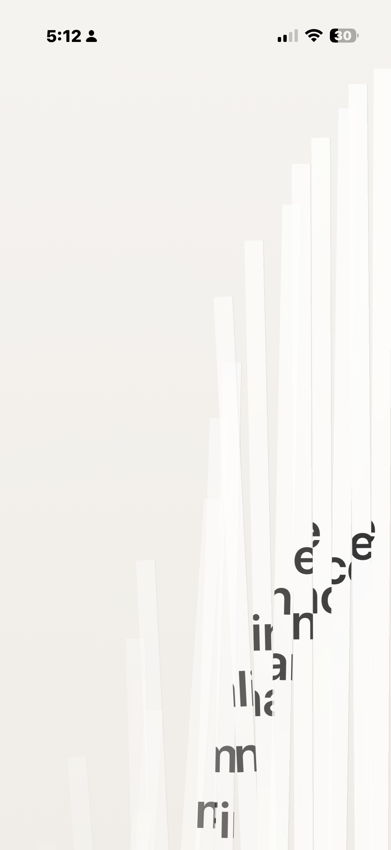
Every productivity app adds features — more views, filters, organization systems. I wanted to remove them. One task, visible at a time. Not top 3, not today's priorities. One. This breaks every UX heuristic about user control — can't reorder, can't see what's next — on purpose. Removing the ability to choose removes decision fatigue; the interface becomes a commitment device, not an organizer. Silent AI synthesis. People think in rambling sentences, not action items — "I need to compare these two websites for the Friday review" becomes "Compare Website Reviews." The AI distills, silently, forcing clarity without asking for it. The Shred, not a checkbox. Completing a task triggers a tearing animation with haptics — destruction, not continuation. One tester: "It feels like crossing something off with a Sharpie, but better." Intentional friction. Adding a new task mid-focus forces a choice: discard or finish what you're doing. Usually the answer is no — which is exactly what prevents task hoarding.
The findings
The app works by refusing you something
What I found
You cannot see your other tasks, reorder them, or check what's next. Every one of those is a usability heuristic broken deliberately. Take the constraint away and it becomes a worse version of Things.
I'm not an engineer and I shipped it anyway
What I found
That is a statement about the tools in 2024 more than about me. The economics of a side project have moved: validating an idea no longer requires funding, a co-founder, or permission.
Capture A
Capture B
Capture C
Capture D
Capture E
Capture F
How it actually went, in order.
Loops, not phases. The order is the one it happened in, not the one it tidies into.
- It started as a complaint about my own to-do list
I looked at my own workflow and then talked to five senior product people I trust. Nobody was forgetting tasks. Everybody was hoarding them.
Then I went through Todoist, Things 3 and Linear properly. They are excellent, and none of them is the problem. The problem is that they're infinite: there is always another list, another view, another tomorrow to move something into, and moving a task from Today to Tomorrow feels enough like progress to keep you doing it.
- Who turned up in beta
I built it for me. Three groups showed up anyway.
Deep-work professionals, roughly 28 to 45 — designers, researchers, engineers whose output depends on flow and whose calendars are shredded by admin.
People with ADHD, who I had not designed for and who became the most vocal group by a distance. The app functions as a cognitive prosthetic for them: it shrinks the world to one manageable object.
And essentialists, roughly 35 to 55, who have worked out that more is not the answer and are after clarity through constraint.
- Two things I took away
- Completion needs a ceremony. The Shred started as a nice piece of animation polish and turned out to be the thing people actually came back for. Closing a loop needs to feel like something happened. - The ADHD feedback found problems everyone had. I hadn't designed for executive-function difficulty, and the reports I got from people who live with it described, in sharper form, exactly what was wrong with the app for everybody else.
- What I'd change
I'd have found the ADHD users on purpose rather than by accident. They arrived organically, months after the decisions that mattered most to them were already made, and I'd have designed differently — and better — knowing they were there.
What I'd flag if this were someone else's project.
What I'd do differently.
The watch app should have been first. Pulling out a phone is too much friction for something that is meant to take five seconds. And I underbuilt onboarding — the whole premise runs against how people expect a to-do app to behave, and explaining where the buttons are doesn't help with that.
How much the metrics are worth.
Fifteen beta testers is not a sample, it's a signal. I've left the qualitative claim that used to sit here as a third metric — a tester quote dressed up as "100% retention insight" — off the page, because a percentage bolted onto an anecdote is exactly the move the rest of this portfolio argues against.