Consumer iOS · design and build, solo

One number. That's it.

Dot is a daily budget tracker that shows you what you have spent today and nothing else. Turn on a target and it counts down instead. It does not connect to your bank, does not ask you to make an account, and does not draw you a chart — six omissions, each of them a decision rather than a gap in the roadmap.

Get Dot on the App Store (opens in a new tab)Free, no account, iOS 16 and later
  • Consumer iOS
  • Personal finance
  • Local-first
  • Designer and developer
At a glance
Role
Design and build — solo
Platform
iPhone, iOS 16 and later
Stack
React Native · Expo · on-device storage
Status
Live on the App Store

Four minutes end to end. In a hurry? The three findings are the argument — everything else is captures.

Capture A — the product, as it presents itself
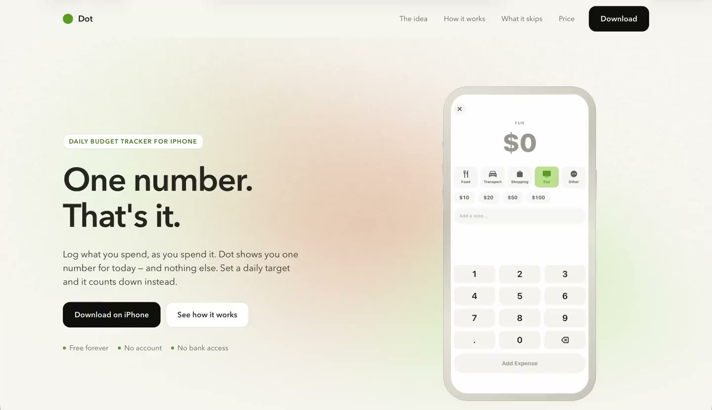
The Dot landing page: the headline 'One number. That's it.' beside an iPhone showing the expense keypad, with category chips for food, transport, shopping, fun and other, preset amounts, and the line 'Free forever · No account · No bank access'.
The pitch and the product make the same argument. The phone on the right is the app's own expense sheet: pick a category, tap a preset, done.
Verdict first — for people with forty portfolios open

A budget app whose design argument is entirely subtraction — six things it refuses to do, each one the reason a previous budget app got deleted in week two.

Number on the screen

1

Number on the screen

Today's total, or what's left if you turned a target on

Actions in a day

3

Actions in a day

Log an expense, glance at the number, close the day

Things it refuses to do

6

Things it refuses to do

Bank sync, day-one budgets, charts, streaks, accounts, subscriptions

Bytes that leave the phone

0

Bytes that leave the phone

No account, no sync server, nothing to breach

The brief — what this solves, and for whom

The decision happens at the till, not in a monthly review.

The use case

Someone at the till, not someone at a spreadsheet.

The moment that decides whether a budget holds is the moment before you spend, standing in a shop with a phone in one hand. A pie chart of last month cannot help you there. One number can.

The design problem

Budget apps fail on day one, not in month three.

They open by asking for bank credentials, category budgets and a monthly plan — a form you fill in before the app has done anything for you. Every one of those questions is a place to give up, and most people give up at the first.

The business problem

There isn't one, and that's the position.

No trial, no tier, no ads, no data to sell — Dot never receives any. A small app that does one thing and is finished does not need a subscription attached to it, and attaching one would have changed what got built.

Three findings

Finding 01Severity: high
Confidence 92% — it is the default in the shipped app

The budget is switched off until you ask for it.

Why I flagged this

Every budget app opens with a setup form: monthly income, category limits, a plan. It is the most abandoned screen in the category, and it arrives before the app has been useful even once.

What I did

Made the daily target optional and off by default. Dot tracks what you spend either way, so day one asks nothing of you — install it, log a coffee, and it has already done its whole job.

The consequence

The number on the home screen has to make sense with no target set. It reads as today's total until you turn a target on, at which point the same number starts counting down instead.

What it cost

The feature the app is named for is the one thing it will not push you toward. Anyone reviewing it in thirty seconds sees a spend tracker, not a budgeting tool, and the budgeting is what they were looking for.
Finding 02Severity: high
Confidence 95% — there is no server to check

Not connecting to your bank is the feature, not the backlog.

Why I flagged this

Bank sync is the first thing every competitor advertises and the first thing this category is distrusted for: handing credentials to a third-party aggregator that then holds your statements.

What I did

No credentials, no read access, no aggregator, and no account of any kind — no email, no password, no sync server. Everything lives in storage on the phone.

The consequence

There is nothing to breach, which is a claim the architecture makes rather than the privacy policy. It also removes the entire signup flow: there is no screen between installing and using.

What it cost

Every expense is typed in by hand. That is the honest trade — the app is exactly as accurate as the habit, and the presets exist because a two-tap log is the only version of that habit that survives.
Finding 03Severity: medium
Confidence 84% — a design read, not a measured one

Colour carries the warning, so nothing has to buzz.

Why I flagged this

The usual way to tell someone they are overspending is a notification, a badge, or a red alert — all of which arrive after the fact and train people to dismiss them.

What I did

The circle warms as the day's spend approaches the target: green while there is room, warmer as it closes in, deeper still once past. No alert, no buzz, no badge. There is one notification in the whole app — an evening nudge to close the day — and it ships switched off.

What it cost

A colour gradient is a weaker signal than an interruption, and it only works if the app is opened. It also has to survive colour-blindness and a dark theme, which is why the number is always there in text underneath it.

Captures B — D · the app itself

Capture B — today
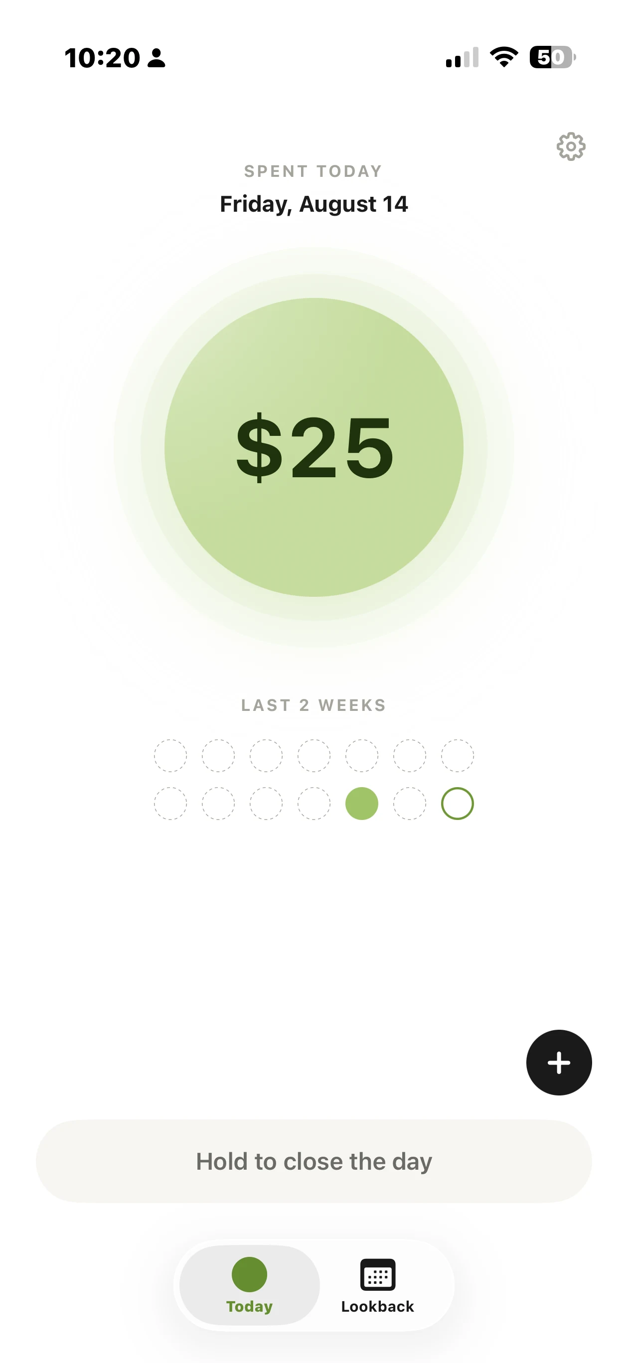
Dot's home screen: 'Spent today, Friday, August 14' above a large green circle reading $25, a Last 2 Weeks strip of fourteen dots with one filled, a plus button, and a 'Hold to close the day' bar above the Today and Lookback tabs.
One number in a circle, and fourteen dots for the fortnight behind it. The only two controls are add an expense and hold to close the day.

Capture C — logging an expense

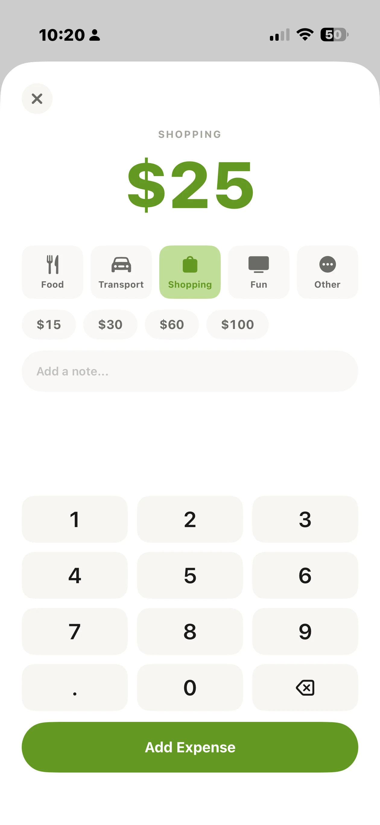
Dot's expense sheet: the category Shopping selected from Food, Transport, Shopping, Fun and Other; preset amounts of $15, $30, $60 and $100; an optional note field; a keypad; and a green Add Expense button.
Five categories, four presets, an optional note. The presets change with the category — $15 to $100 under Shopping, $10 to $100 under Fun — so the common amount is usually one tap.

Capture D — Lookback

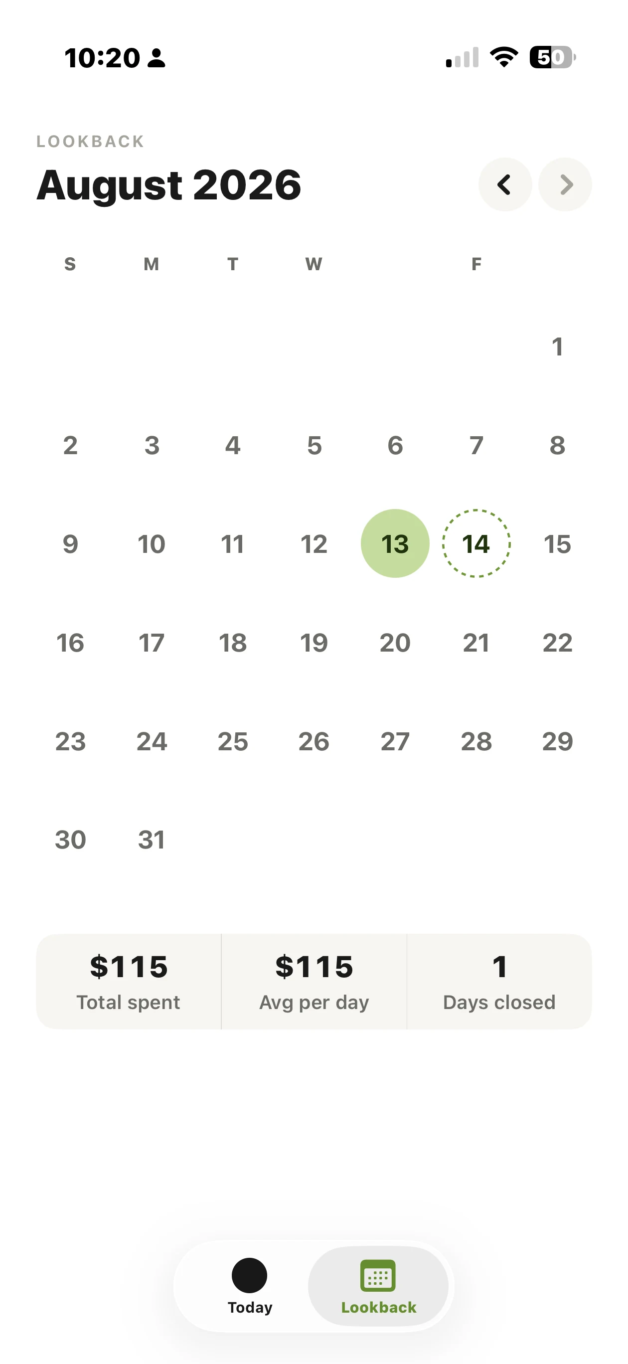
Dot's Lookback calendar for August 2026: a month grid with the 13th filled green as a closed day and the 14th outlined as today, above a summary reading $115 total spent, $115 average per day, and 1 day closed.
Total spent, average per day, days closed. That is the entire history feature — a closed day is filled, today is outlined, and there is no chart anywhere in the app.
Open findings — filed against me

What I'd flag if this were someone else's project.

Open · High

Local-only means losing the phone loses the history.

Nothing leaves the device, which is the privacy claim and also the backup story: there isn't one. That is the honest cost of refusing a sync server, and it is the omission most likely to hurt a real user rather than merely inconvenience them.

Open · Medium

Manual entry only works while you keep entering.

Refusing the bank connection means the app is exactly as accurate as the user's habit. Bank sync is the feature people ask for precisely because it survives their forgetting. Dot bets on a two-tap log being fast enough to stay a habit — and that is a bet, not a finding.

Open · Won't fix

Free forever has no maintenance budget behind it.

No revenue is a design position, not a plan. It holds as long as the app stays finished. The first time iOS forces real work, the thing paying for that work is my own time.