AI product, built solo

A design critique you can argue with — and watch change its mind

Post a screen in Slack and you get emoji. Book a mentor and you're waiting until Thursday. Pay for an audit and it lands after you've already shipped. Paste it into a chatbot and you get flattery, which is worse than nothing. So I built the reviewer I actually wanted: it ranks findings by what they'll cost you, points at the pixels it's talking about, says so when it can't be sure — and if you push back, it has to defend the call or take it back.

Try Deskcrit (opens in a new tab)Live, no signup — drop in a screen and argue with it
  • AI product
  • Agent design
  • Trust and calibration
  • Prompt systems
  • Designer who ships
At a glance
Product
Deskcrit — AI design critique
Role
Strategy, interaction, prompt system, build — solo
Timeline
Brief to working product in one week
Stack
Next.js · Anthropic vision API
Process
Designed in Claude Design, built with Claude Code
Status
Live — public demo mode, July 2026

Five minutes end to end. If you only have one, read the exchange below — that's the product.

Severity · MediumConfidence · cappedFinding 03

The primary action sits inside a scrolling region, so on a short viewport it is below the fold at rest.

Evidence
Points straight at the region and the button sitting inside it. It can't make a claim without showing you where.
Capped
It measured this off the picture, so it's an estimate and says so. And it's one screen — it has no idea whether the next step offers you the same action again.
AgreeChallenge

The designer

This is a kiosk build. It runs on one fixed 1080p screen, mounted portrait, and nothing about it scrolls.

RevisedSeverity · MediumLow

A fixed screen kills the fold problem, and the fold problem was the whole reason this was a Medium. It stays on the list at Low, though — that button is still the quietest thing in its own region, and that part had nothing to do with the viewport.

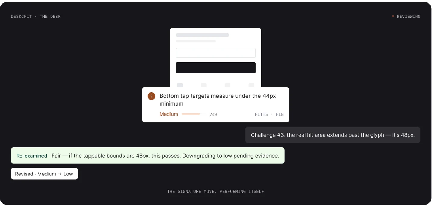
Rendered from specThis is the whole reason the product exists. I drew it from the spec rather than grabbing a screenshot — I don't have captures of the live build handy, and faking one on a page about unevidenced claims would be a bit much. Note what happens: the severity moves, it tells you why it moved, and the original finding doesn't quietly disappear.
week, brief to deployed

1

week, brief to deployed

nobody else on it — strategy, interaction, prompts, build

iterations to get it right

4

iterations to get it right

the first three were wizards; the fourth threw the stepper out

ways an argument can end

3

ways an argument can end

it holds, it folds, or it moves — and you see which

steps before your first critique

0

steps before your first critique

no signup, no waitlist, no sample data to click through

Three decisions

All three made it worse to demo.

  1. 01

    Threw out three finished versions with two days left

    The first three were a wizard: fill in a form, watch it review, read a report. Nothing broken about it. But the whole pitch is a reviewer you can talk back to, and I'd buried the talking back in a textarea on the third screen.

    I'd made arguing with it a feature you have to go find.

    Read the reasoning
  2. 02

    Stopped it from sounding sure when it isn't

    It can only see one screen, so it isn't allowed to score the flow. It measures tap targets off pixels, so it calls those estimates. And when the answer depends on something it can't see, it says so and hands the call back to you.

    A cockier version would demo better. It would also be lying to you.

    Read the reasoning
  3. 03

    Let it come back with almost nothing

    It never pads a list to look thorough, so some runs turn up one small thing. Same reason it can't open with a compliment, can't tell you to “consider improving the hierarchy,” and can't say “as an AI.”

    Bad for the demo. It's the only reason five findings means anything.

    Read the reasoning
Decision 01 · the pivot

Three versions in, I realized I'd built the wrong shape.

Nothing changed about the judgment — same model, same findings, same way of ranking them. What changed is where you argue with it.

Wizard · stepper across the top

Fill in the intake form
Watch it review
Read the report
Want to argue? Find the textarea

Three screens, one direction, and the only thing that makes this different sitting at the bottom of the last one.

Versions one to threeIt worked. Every screen was consistent with the next one. But arguing with it was something you had to go looking for, which made it a feature of a report instead of the point of the whole thing.

One conversation

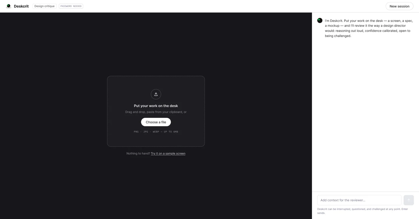
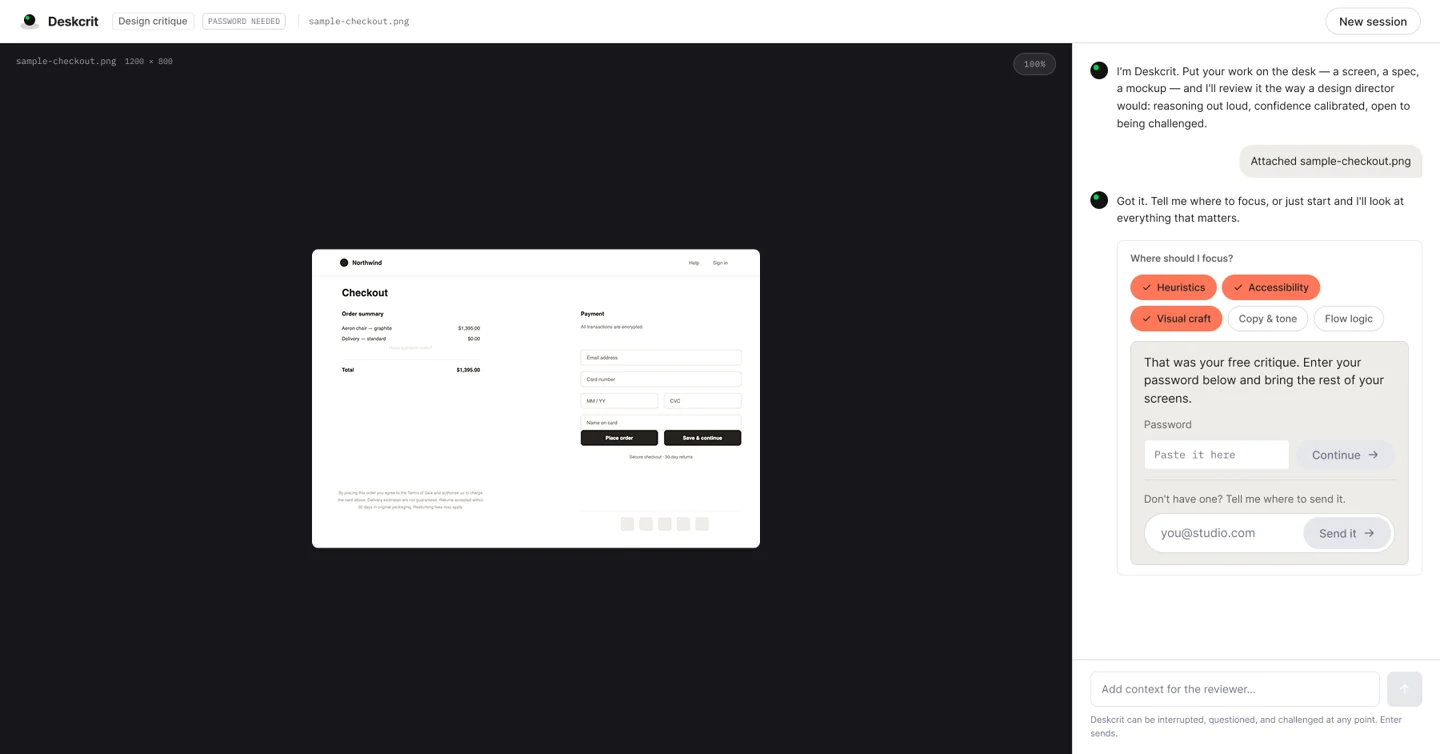
Drop a screen in
Findings come back as cards
Agree or Challenge on each one
Want to argue? Just talk

One surface, no stepper, and arguing is the obvious thing to do rather than a button you have to hunt for.

Version fourI collapsed the whole thing into the conversation it had been describing all along. The judgment didn't move an inch — same severity model, same caps. Arguing just stopped being a feature.

The fork

Three versions in, I had a wizard that worked: intake form, review screen, report, stepper across the top. Spend the last two days polishing it, or pull the whole architecture apart with most of the week gone.

The tension

Nothing was broken. That's what made it a hard call. But I'd taken “a reviewer you can talk back to” and built it as forms and panels, so talking back meant hunting for a textarea inside a card. A wizard suits a job that finishes. Arguing about a design doesn't finish.

The call

I pulled it apart. Version four is one conversation: you drop a screen in, findings come back as cards in the thread, and every one of them has Agree and Challenge sitting right there. If the thing that makes your product different is an interaction, that interaction has to be the interface.

The consequence

Arguing stopped being a feature and turned into just talking. It also cost me three finished versions in a one-week build, and left me with a product that's genuinely hard to screenshot — which matters more than it sounds when the way people find it is a portfolio page.

Decision 02 · calibration

It admits what it can't see. That's the only reason to believe the rest.

I've spent twenty years designing AI platforms for banks and insurers, where a bad design decision doesn't cost you churn, it costs you a compliance finding. That work left me with one conviction: the hard part of human-AI collaboration was never making the machine smarter. It's whether a person can see how it got there and push back on it.

So the hedging here is engineered, not decoration. The model could always see the screen — that was never the hard part. What you get out of a general chatbot is commentary: nothing ranked, nothing you can go check, and it agrees with you. Getting from that to critique is all design work. None of it arrives with the model, which is why the system is the product and not the model.

The fork

Let it answer everything in the same confident voice, or draw a line around what it genuinely can't know from one screen and make it stay behind that line.

The tension

Every cap is the product admitting something, and admissions don't impress anybody. You get about ninety seconds from a first-time visitor. Spending part of that on “I can't tell from here” looks weak next to something that just answers.

The call

Three caps. Each one written as the sentence you'll actually read, not as a score — it can't grade the flow when it's only seen one screen, it calls pixel measurements estimates, and when the answer depends on context it doesn't have, it says so and gives you the call.

The consequence

Now when it doesn't hedge, you can believe it. That's the whole return. The cost is that the product is at its least impressive in the first ninety seconds, and the caps are the first thing a skeptic runs into.

The confidence caps

Three things it isn't allowed to sound sure about.

In the build
3
Shown as a %
0
K1

Anything about the flow

Where this step sits, what it assumes you already did, whether you can recover from an error here — all of that lives on screens it hasn't seen. It can raise the question. It can't put a number on it.

I can only see this step

K2

Anything it measured off the picture

Tap targets and contrast ratios get read off the image, not out of your code or your tokens. Close enough to be worth telling you about, not close enough to state as fact — so it says estimate, and the severity gets held down to match.

Estimate

K3

Calls that depend on what it can't see

Is this pattern wrong, or is it a kiosk, a disclosure your legal team wrote, a deadline somebody already fought about? You can't tell from a screen. So it names the tension and hands you the decision — which is half the reason the challenge flow exists at all.

Yours to call

The phrase on the right is what it actually says to you. I wrote the caps as sentences instead of percentages on purpose — “I can only see this step” tells you what to do next. A confidence score of 62% tells you nothing you can act on.

Decision 03 · the voice

If it can't tell you there's nothing wrong, it can't tell you anything.

The fork

Make sure every run comes back with a decent list of findings, or let it come back nearly empty when there's nearly nothing to say.

The tension

Padding is invisible, which is exactly what makes it the disease. Three real findings and two made-up ones look the same to you until you act on one of the made-up ones. After that, nothing it ever tells you is worth much.

The call

“Nothing significant here” is a legitimate answer, and it never stretches a list to look thorough. Same reason I wrote the voice rules as bans, and wrote the ways it could embarrass itself before I wrote the happy path.

The consequence

Worse demo, better product. Somebody can run it and watch it barely do anything — and that's the only reason a list of five findings is worth reading when it does show up.

Banned in spec

Three things it isn't allowed to say to you.

Opening with a compliment
“Great start!” before it gets to the findings. It's buying goodwill with the one thing a critique actually owns — that when it says something is good, you believe it.
Advice you can't act on
“Consider improving the hierarchy.” You can't do anything with that, you can't prove it wrong, and it reads exactly the same as if it never looked at your screen.
“As an AI”
A disclaimer about itself where a claim about your screen should be. If it's going to hedge, it should hedge on the evidence, not on what it is.

You find out what a voice is really made of in the weird cases, so I wrote those first. Upload a photo of your dog and it says “This looks like a very good dog, but I critique interfaces.” Not an error message, and not pretending it can review a dog.

What each choice cost

Five trades, and what I paid for each one.

Every one of these made the thing harder to build or worse to demo. Take the cost column off a list like this and you're just showing off.

Ship the wizard that worked, or throw out three versions and start over
What I choseStarted over. Version four folded intake, review and report into one conversation, and arguing with a finding turned into just talking.
What it costsThree finished versions gone, in a build that only had a week in it. And a conversation is much harder to screenshot than a report — which matters when people find the thing through a portfolio page.
Let it answer everything, or cap it where it can't actually know
What I choseCapped it, and wrote each cap as the sentence you read instead of a score.
What it costsA cockier version demos better. Hedging looks like weakness the first time you meet it, and I'm betting on credibility, which pays a lot slower than confidence does.
Guarantee a full list of findings, or let it say “nothing significant here”
What I choseLet it. It never stretches a list to look thorough, so some runs come back nearly empty.
What it costsAbout the worst demo you could design. Somebody shows up, runs it, and watches it do almost nothing. That's what I'm paying for five findings meaning five findings.
Get the signup first, or lead with the critique
What I choseLead with the critique. No signup, no waitlist, nothing to click through first.
What it costsNo email list and no idea who's using it — part of why the number I care about is still a number I don't have.
Describe the agent's judgment, or specify it tightly enough to ship
What I choseSpecified it. Severity model, what happens when you challenge it, the confidence caps, the banned phrases, and the embarrassing cases written before the happy path.
What it costsMost of the week went into a document nobody will ever see, for a product whose entire visible surface is a text field and a card.
The spec

The part nobody sees, which took most of the week.

What you see is a text field and a card. What's underneath it is a set of rules about judgment, and that's the entire difference between this and a chatbot with opinions.

Four principles, and what each one forbids
Show the reasoning or don't ship the finding
Nothing goes out without why it's a problem and where it is on your screen. An opinion with no reasoning behind it is just noise delivered confidently.
You can argue with all of it
Challenge anything. It either comes back with specifics or it backs down and changes the record — no third option where it repeats itself at you.
It says when it can't tell
This is the one people push back on, and it's the one I'd defend hardest. You can't trust the confident answers from something that's never uncertain.
Nothing between you and the first critique
No signup, no waitlist, no sample data to click through. You'll give a new product about ninety seconds, and I'd rather spend all of it on the actual thing.
The challenge protocol, and its three endings

When you challenge something, the model gets your argument with one instruction attached: answer what they actually said, don't just say the finding again. Restating is the thing that makes an agent feel like a wall while it's technically replying to you, and it's the specific behavior I was trying to design out.

Defended
It's sticking with the call, and it has to tell you something new about your screen to do that. Repeating itself doesn't count as defending anything.
Conceded
You knew something it didn't, and the finding comes off the list. It comes off on the record though — the exchange stays where you can see it.
Revised
You were half right and the severity moves. It says what moved and why, so you can tell the difference between it reconsidering and it caving.

Nowhere does this product tell you to trust it. You either come to trust it or you don't, one argument at a time, and those three are the only ways an argument is allowed to finish.

Commentary and critique, side by side

Commentary

What you get from a chatbot

  • Nothing ranked, and it wants to agree with you — leads with a compliment
  • Claims you can't go and check for yourself
  • Sounds equally sure about all of it
  • You read it and that's the end. There's nobody to argue with

Critique

What I specified this to do

  • Ranked by what it'll cost you, and stingy with praise — no compliment opener
  • Points at the pixels. Every claim lands somewhere specific
  • Tells you where it's guessing, and holds itself down when it can't know
  • You can argue with any of it, and the argument stays on the record
What I can't design around

Where this could still fall over.

You'll notice there are no results on this page. It went live in July 2026 and I have no usage data yet. Putting a number here anyway would be the exact thing the product exists to argue against, so instead here's the number I'm waiting on: how often somebody pushes back at least once. If people argue with it, the trust design worked. If they just read it and close the tab, I've built a nicer report generator and I was wrong about the whole premise.

The hedging might just read as weak. Something that tells you “I can't see enough to call this one” is more useful than something that answers everything, and it is definitely less impressive. I'm betting credibility beats confidence over time. That's a bet, not a result, and I'll know from the pushback numbers.

I also don't know if people will argue with software. Everything they'd need is right there — Agree, Challenge, and a box that takes anything you want to type. But nobody's in the habit of talking back to a review tool, and habits usually have to be taught. If I have to teach it, the interface isn't done.

And no designer but me has taken a run at the voice. I wrote the bans, I wrote the awkward cases, and I'm also the person least likely to be annoyed by how it talks. The dog test tells me the tone holds. It tells me nothing about whether a room full of design directors would rank these findings in the same order it does.

This is a portfolio piece and I'm not going to pretend otherwise — it's the first of a few things I want to build on the same idea: take expert judgment, hand it to an agent, and leave the reasoning where you can check it. Critique first, research synthesis next, design system audits after that. It's also me making a point about what a designer can do now. I'd rather specify an agent's judgment tightly enough to ship it than mock up another screen of an AI product that doesn't exist.

The product

Everything above is a claim. The product is the evidence.

Drop a screen in and push back on the first thing it tells you. It defends the call, softens it, or takes it back — that exchange is the entire argument of this page, and it takes about a minute to check.

Try Deskcrit (opens in a new tab)