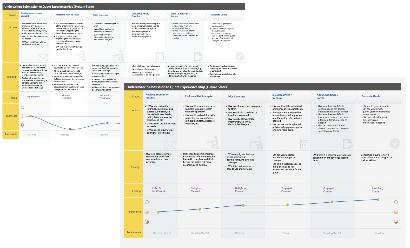
The insurance provider's current system & processes rely on the majority of users' time to spend on manual processing and data entry. Slower legacy application and use of multiple applications negatively impact user's productivity and experience.
Underwriters spent a long time on underwriting policy resulting in a higher risk of losing business opportunities. The current legacy system requires a high number of clicks and wait times due to the counter-intuitive navigation structure and reloading of information.
I was responsible for all aspects of the project, from requirements gathering, experience, visual design, and usability testing. I collaborated with stakeholders across all LOBs (Line of Business) to lead design workshops, conduct both individual interviews for power users, collect feedback, and facilitate testing.
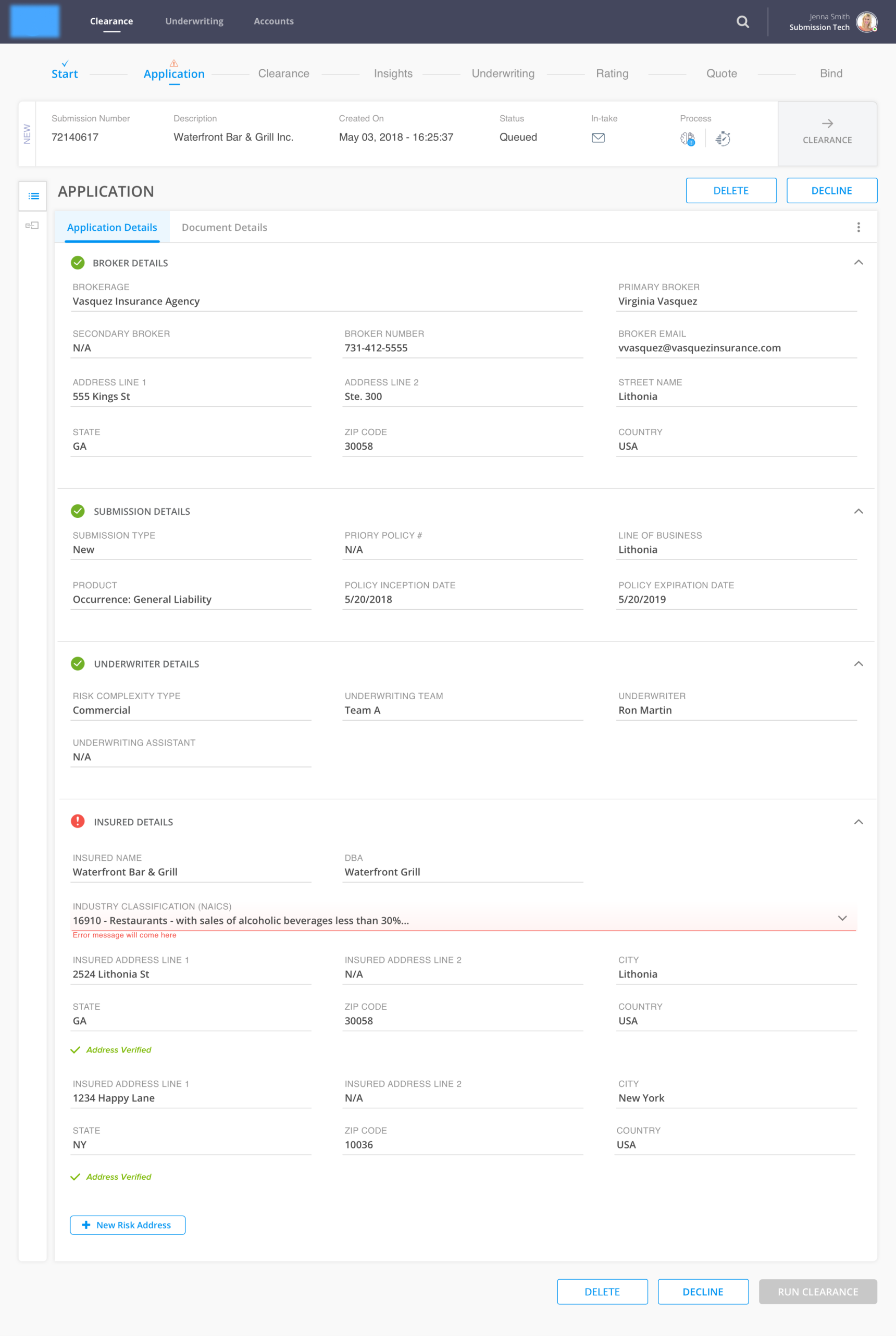
We redesigned the B2B underwriting platform to consolidate all legacy underwriting platforms across the program to provide an enhanced customer experience by leveraging a modern technology stack and a UX-first development approach.
The application will integrate with the Submission Intake & Clearance system, Partners CRM (Customer Relationship Management), Pricing Engine, Forms Attachment, Document Generation system, Policy Issuance, and Document Management systems to enable end-to-end underwriting workflows.
Target users for this application was moslty underwriters age 35-45 and submission technicians who review the submission requests to determine whether it can be cleared for underwriting age 25-30.
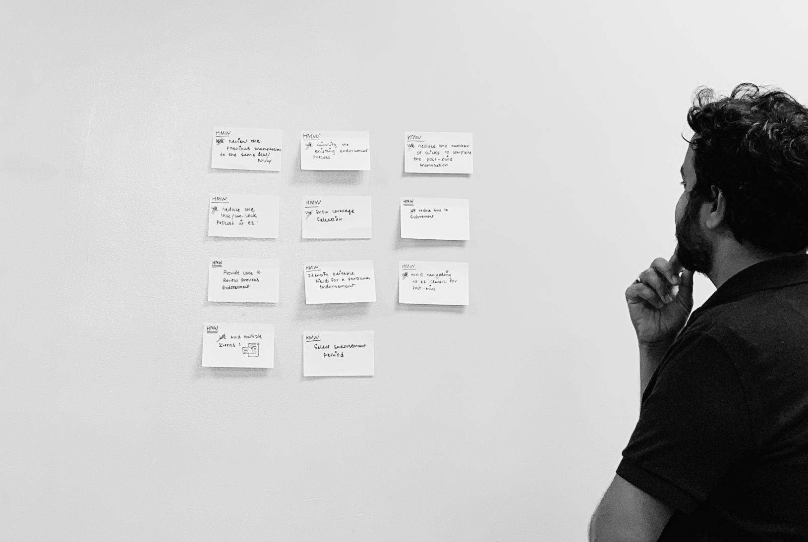
To understand the right problem, we need to deep drive and plan for a design workshop, where I facilitated the workshop with business users, product owners, and subject matter experts. By using design sprint techniques like HMW - How Might We and sailboat exercise to streamline the requirement.
We found that the users are not ready to accept the new process. We help them understand the benefits and how they can save a lot of time using the automation process, OCR, and so on.
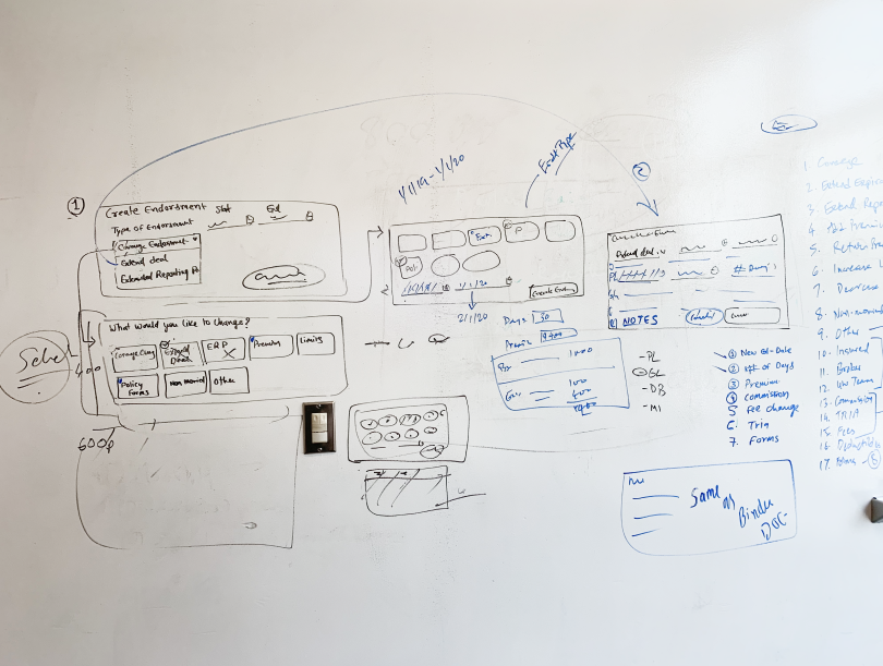
We come up with 6 concepts to solve the problem for the initial phase. We did multiple prototypes and validated them with business and product owners. We had a design wall, where we put all the design ideas and design concepts on the wall and invite business users to vote on ideas. Out of 6, we selected 3 concepts to work on detail follow.
To evaluate the new application, we relied on usage metrics in conjunction with 6 usability tests. This allowed us to gain a deeper understanding by combining both qualitative and quantitative information. Although users were able to get through the process more quickly, they continued to struggle with forms section and iconography. We did 3-4 iterations to reach the point where things were smooth.
We have successfully onboard underwriters into our new application with the satisfaction 75% of users were happy to use new application and believe that new it make their life easy.


Based on the feedback interviews with the power users, which was more influencer group within underwriters, we found a matrix. 75% user was happy to use the application. We solved one of the user's biggest problems, i.e. using multiple apps and paperwork from their workflow.
What can I do better?
- Spend more time on qualitative research.
- Select participants from other LOBs
- Less Technical constraints